Showing posts with label BP#2. Show all posts

Tuesday, March 17, 2015

W. Rivera's blog #2 Identify and Describe Visual Elements

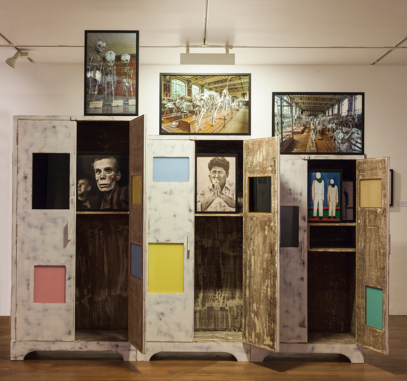
"After Midnight" He is an interestingly beautiful collection of art pieces contributing to a very amazing exhibit. The context of this exhibit is late 40's in last century with a content representing modernizing of Indian Art, it's evolution and how it all seemingly merges into collection of geometric shape, featuring what appear to be fully functioning 3-dimensional cabinets with space to hold 2-dimensional paintings. 
The paintings are made by multiple different painters hence the different styles and technique of featured paintings made with old and water colors.

 The overall contour are both vertical and horizontal and combine with each other to make multiple square and rectangle shapes that form into one another. The very bottom of the cabinets have curved style to show negative space that can be seen directly through. There is also negative space being used as the cabinet doors are all opening, revealing paintings within. Within the inside of the cabinets are wooden colored textured pattern that repeats through out the inside of the cabinet. Aside from normal colored wood pattern, the inside of the cabinets have different colored squares of warm and cool colors of peach yellow, teal and beige. The colors all appear to have a flesh colored hue. 
 

With the use of empty space inside the cabinets there are three paintings, one for each of the three cabinets. The paintings feature people being depicted in an oppressed manner. There are three paintings above each of one of the three cabinets as well. Those paintings however depict human skeletons in exuberant poses. A deep emotional response in contrast to the to the alive humans right beneath them, almost encapsulated.

From The Moment I had laid my eyes in this exhibit I felt complete attraction and utmost admiration. The skeleton paintings are symbolic to the deathly nature of the oppressed people of the Indian culture that the artist originate from. Inside the cabinets the humans are alive but above them they are skeletons seem like angels floating above their human counter-parts. The flat colored, fleshly toned paintings inside the cabinets represent humanity being confined but still slightly freed to a minimal degree. All in All, I really like this exhibit. 


Monday, March 16, 2015

BP#2

Tulips 4


This is a 2D piece of tulips. The first thing that struck me about this painting was the brightly colored tulips scattered throughout the canvas. As I analyzed the artwork more closely, I noticed that most of the shapes in this work are organic.  The diagonal lines that make up the leaves and top of the tulips imply movement and direction. The tulips are what fill the positive space and the chalkboard-colored background would have to be the negative space. The yellow color of the tulips seems very warm and the different light green colors of the leaves emit warmth, as well. The artist definitely made use of analogous colors by using light green and yellow. Texture-wise, the implied surface quality of this piece looks quite smooth. In terms of pattern, the motif is yellow tulips and light green tulip leaves.
Since we recently discussed Georgia O’Keefe and her larger-than-life flower paintings, this work of art by Alex Katz easily reminds me of O’Keefe’s work. I think Katz’s purpose for creating this piece was to portray the brighter side of life. Choosing such a dark color for a background to compliment the subject of his painting means something. The gloomy background represents all the things we consider to be malicious and the vivid tulips represent hope that still exists despite all the cruelty. Katz could have covered the whole painting with yellow tulips, but instead he chose to let the gloomy color show through in between the leaves and the tulips. This piece is a reminder that one needs not to take a stand to either be pessimistic because of the cruelties of life or be optimistic of all the wonderful things in life. Rather, we must only understand that good and bad exist and that it is up to us to fill up the canvas of more tulips or not. 

Blog #2

This piece of art was created in 1978 by an American painter named, Al Held. It can be found in the Museum of Modern Art. It was created during a period when Held went from gestural painting to hard edge painting. It was also when he changed his medium from oil to water based acrylic. This work of art is a 2D painting. All lines are visible and are created by various shapes that can be seen with the eye. They are all geometric, mostly circles and triangles. It has many horizontal and vertical lines which symbolize action and strength. The artist also uses primary and secondary colors, with a majority of the painting being blue. Although blue is a cool color and should create a sense of calmness, the way the artist uses it and the shapes in this painting creates a feeling of chaos. The gray areas appear to be a road that has been broken up by the array of colors around it. Seeing how the artist uses all of his space, there is no negative space. There is a pattern of shapes and colors. This work of art is a painting however, it looks as if it was created digitally implying a smooth texture. I feel that the artist created this work of art to trick the human eye. When looking at the painting, it’s almost impossible to tell where one shape begins and ends. In my opinion, this represents disorder and trying to find a balance.

Blog Post #2

This piece goes by the title of "Going Home!" and was created by Peter Land in 2001. It's one of the current exhibitions in MoMA, categorized under "drawings", therefore two-dimensional. It is watercolor and pencil on paper, with the measurements of 60 by 78 1/2 inches. What first captured my attention was the bright colors of the trees in the fore/mid-ground; tints of greens and yellows (analogous colors). The diagonal, and quite geometric branches of the trees seem to have a pattern, almost looking ladder-like. Looking more towards the center of the drawing are a few trees or bushes scattered around various hills, all separated by a curvy light blue road. There is also a small figure of a boy running towards a village in the distance. The buildings are colored of brown and grays. Now to what I would describe as the background, lies the night sky. There are a few spots of yellow which resemble glowing stars (all I would say have organic shapes). To the left side of the stars is a mist of light blue, and right in the center of that mist is the bright yellow colored moon. The moon appears to have a face, smiling and looking at the boy figure trying to get home. To me, the drawing looks so fairytale-like, as if it was taken out of a children's book. In my own words I would say it's based off of a story; a boy trying to get home from an adventure, accompanied by the beauty of the surroundings he passes along his journey back home.

Blog Post #2

                                                   Portrait of a Woman    


        Egon Schiele's 'Portrait of a Woman' is housed in the Metropolitan Museum of Art. It is a 5 1/2 by 3 1/2 inch colored lithograph. This portrait is mostly comprised of lines and shapes. The lines, the whole of the work are mostly faint. There are a few strong, dark lines that make up the woman's face, neck and hands. Her arms are long, thin rectangles and her face is the shape of an oval. The rest of the shapes that make up her body are more organic. 
       This work is characterized by its negative and positive space. The negative space is the beige background and the positive space is comprised of the woman's body and the white 'halo' behind her head. The beige paper this work was created on appears to have some sort of grainy texture. It is also one of the few colors that make up this picture. There is also the red of the woman's hair, eyebrows and lips. She is wearing a black headband. This piece of artwork has a very warm feel to it. 
        It is hard to say what the meaning behind a figure drawing could possibly be. I think that Schiele wanted to capture this woman's delicate beauty and the strength of her emotions. I find it interesting that the only part of this portrait that has any detail is the woman's eyes. They are looking past the artist and appear wistful and faraway. The look on her face and the way her hands are clasped tight and held close to her face convey to me an overall feeling of sadness.

Blog post #2

This piece is untitled. It was made by Kazimir Malevich.

This is a oil painting on canvas. The first visual element I saw was line. There are a bunch of straight lines in many different directions forming shapes. The lines are implied by the shapes clumped together. It looks like the lines are rotating around the center of the painting. All the shapes are painted to be 2-D with no implied depth. Every shape is geometric, there are no curved lines or shapes. Just as the lines rotate around the center, so do the shapes. There is a lot of negative space near the edges of the canvas. Most of the positive space is centered on the painting. The artist used primary and tertiary colors along with black and grey. The artist kept similar colors near each other in the array of shapes. The texture on this shape is implied. Some shapes look like they are rough while others appear to be smooth. To sum up how this painting looks, it is made up of different wide polygon shapes with one triangle in a variety of primary and tertiary colors. There is a big polygon in the center and the shapes around it connect perfectly along their edges and the other shapes are rotating around it as if the middle shape was pulling the others in. All the shapes are neat and organized on the painting, the shapes never overlap. The center clump has more cool and earthy colors while the shapes on the outside are warm colors. The center looks like a polygonal earth and I see it as showing how people think everything revolves around us.

#2

            The Menaced Assassin by one of the great surrealists, Rene Magritte, first appeared in 1927 during the artist’s first solo exhibition. Currently on display in the MoMA, this painting is oil on canvas measuring 59 1/4 x 6’4 7/8, making it one of his largest works. Taking place in a small room with very light pink walls and a tan floor, the painting creates a strong contrast between its cooler colored surroundings and monochromatic characters. In the foreground of the piece we see two bowler hat wearing men looking suspicious and flanking the doorway. The one on the left is holding a cudgel while the right one holds a net. The shapes used for these figures seem to be rectangular and normal in terms of body structure with circular peach toned heads. Both are wearing all black clothing with white undershirts and black ties. The implied light of these two give us some sense of depth, as if we were looking into this painting. The lines stretching throughout the floor seem to reinforce this idea. Reaching the mid-section we have a man slightly resembling the previous two in terms of shape and clothing, but missing a bowler hat; a vintage record player resting on top a small table, a chair with the mans jacket and hat on it, a dark red suitcase on the floor, and finally a presumably dead pale woman lying nude on a red bed with blood coming out of her mouth. Reaching the background of the piece another doorway is observed with an engraved fence on the bottom. At this opening, you see only the heads of three men, strongly resembling the rest. The middle and right man are concentrated with the scene while the left man seems to be looking at the other two. In back of them, mountains varying from grey-white topped with a light blue sky.         
            Almost instantaneously this painting reminds me of old school detective novels. Given the time period, it can be heavily implied that Magritte was influenced by the rise of crime films. Even the perspective gives us that same moviegoer feel. It’s a fairly straightforward piece, incredibly immersive, but the mystery it holds is probably the best aspect. It’s hard to decipher who really is the ‘bad guy’ in this painting. I see it as the man in the middle committed the murder and the other five men are ambushing him at the scene of the crime. But then why are the two outer men holding weapons? Why is one of the heads in the back looking at the others? It’s like viewing a still from a crime film, never to know the resolution or cause.

Blog Post # 2


Dave Theurer. Tempest. 1981Dave Theurer"Tempest" From the Museum of Modern Art

This piece of art is classified as graphic design .This piece of art spoke to me because the gamer in me couldn't resist looking up a video game inspired piece of art. Isn't art supposed to do that though inspire ,well enough of me prattling on let's get down to business . The use of primary colors(red, blue, yellow) is only brought to light by the negative space which is the black ,not to mention the other colors . The lines in this work is straight and precise ( In the draft for this I was going to describe the lines as rigid but i had a change of mind and different perspective) to ring the observer to the focal point of the design where i looks like you going into warp drive( i can't help it i'm a bit of a gaming nerd ). The shape that appear in this design seem to be Geometric and organic. Upon going back to the source material this is actual footage from the game that is in the architecture and design section at MoMa i know this is a game now but back when i was looking and searching for art i was looking for something i could relate to something i could speak on. In a way Video games are artistic views of real life or simulated universes brought to life by imagination.Now i'm gonna leave you with this though next time you plug into the internet to play a game or turn on your video game console realize your playing someone's or rather a team of graphic designers artistry and all you had to pay was fifty or sixty buck while people spend thousands or even millions for a Van gogh or Monet .

Blog Post #2

Creative Artists Agency (Los Angeles)
Artist - Sarah Morris
Found in MoMa Musesuem


This art is so beauitful to me it screams with a lot of colors. This is a 2D art work made with synthetic polymer paint on canvas, this art work has a lot of horizonatal lines and diagonal lines meaning this art work is calm but with some action from the shapes being created. This also contains geometric shapes like the triangles, hexagons rhombus trapezoid and other few geometric shapes.There is a use of primary colors theres a few red blue and violet. Cool colors are used is blue colors in this artwork there is also a monochromatic here the use of same colors. It is also complementary because each color enchances and emphasize one another it makes the colors pop. The texture on this painting is implied because it is a painting and i have no actual feel to it. There is a pattern a repeated motif and design repeated colors, shapes and lines. This artwork was made in the inspiration of Los Angeles. My subjective thought to this artwork is, very geometric and has a lot of lines and the colors are bright and playful. When this artist painted this there inspiration or what they saw must of been filled with such bright cool colors, but made it sort of bold with the geometric shapes she picked like the hexagons.There are some dark and light spaces but i dont think thery are negative spaces i feel the artist added those colors for a reason. Even though in my opinion Los Angeles seems to be a very fun and open place, but when she painted this artwork she saw something completely different then what im imagining like the use of her hexagons and her other geometric shapes, she sees the place where there is a lot of hollywood actors and producers and directors everything is connected. Like she made this as a representation of Los Angeles but the verison of entertainent industry. This art work caught my attention and made me feel happy because of her colors used, and her use of her geometric shapes i think that is really what caught my attention and the idea that it looks as if it is going up like a snake. I also think that the texture of this painting is soft and flat.This artwork can give a different way of expression but is all on how someone see's it and feels it. I actually showed this to my sibling and said he felt curious, puzzled and thought that it was creative. I thought her artwork shows what exactly what she saw and felt and her idea of what she learned of the entertainment industry. This is a very interesting artwork to look at and will cause why she used those forms.

blog #2

I came across this painting in the museum of modern art; it’s an oil painting by John smith which was painted on 2013. Its dimension is 60x48. It caught my attention because it sort of reminded me of the Caribbean because of the palm trees and the sunset.  This painting made me think of the Dominican Republic; the hot air the beautiful sunset and the blue green water. This is a 2 dimensional painting of organic shapes with primary (red, yellow, and blue), secondary (orange, green) and tertiary (red orange, yellow green) colors. There is a pattern with the red, blue and yellow lines at the beginning of the painting and then the pattern begins again towards the middle of the painting. They are only horizontal lines on this painting .They suggest calm, quiet and relaxed comfort. This reminds you of the beach, the sun beaming on your face as you relax on the sand. The painting has no negative space only positive space. The colors catch my attention because they are very vibrant. Out of all the paintings I looked at I loved this one the most .I think the artist didn’t name this painting because people have different interpretations of this painting; and probably he wanted us to name this painting according to how we felt about it. The black palm trees represent happiness, and vacation. The artist wants us to look at this picture and remember the hot weather and how happy we get when we think about a vacation.

Sunday, March 15, 2015

BP#2

Browsing the new blog assignment page I stumbled upon the collection of museums in which I must choose from to post my next blog, I chose to take a closer look at the Studio Museum in Harlem. The name and title of this work of art I've chosen is "Conversation with Stanley Whitney", by Trenton Doyle Hancock. This particular piece is a painting that was created with graphite, ink, and acrylic on paper. This is a two dimensional painting of a geometric shaped square with both primary, secondary complimentary and also tertiary colors. The pattern in this figure are the colorful triangles such as purple, green, orange, red, blue, yellow pointing downwards from the top. There are both diagonal and horizontal lines in this painting giving it a more meaningful image. The horizontal lines along the left side are purple giving it a calm appearance between black gaps providing negative space. On the right side there are diagonal lines which are black surrounded by purple gaps making the painting appear dramatic and imply action, movement. There are two leaves apart of the dominant object as positive space on each side of the painting and they are completely white as the foreground, but in the background the artist created a lot of negative space leaving it completely black. I feel this image has a dramatic affect expressing life and death with how the artist included warm and cool colors to influence eachother.

BP#2


I was looking through the online art collection of The Metropolitan Museum of Art website and this piece of artwork titled “Red-green and Violet-Yellow Rhythms’’ grabbed my attention because of its vibrant color use. This is an eye-catching painting by German artist Paul Klee. Its measurement is fourteen and three fourth inch by thirteen and one fourth inch. Oil paint and ink has been used on a cardboard to make this beautiful two-dimensional piece. The whole painting has a geometric pattern. There is no negative space visible. I find this art work somewhat similar to Mondrian’s style. Primary colors- red, yellow and secondary colors- violet, green has been used mostly to fill the geometric shapes. There is shading of colors in some parts of this artwork. I can see a few tertiary colors too such as teal (mixture of blue and green), citron (mixture of green and orange), and russet (mixture of orange and purple). Most certainly, each of the shape is outlined by ink. A few tree-like objects are also painted with dark green color. In the middle left of the artwork, in a grey colored area, the artist signed his name and the year he painted this which was 1920. The painting seems to have a coarse texture. When I look at this picture, all the vibrant colors specially red and green, the rhythm of the geometric shapes and the trees makes me think of Christmas, the holiday season. As we all know, traditional red and green are the colors of Christmas. We see decorations and colorful lights everywhere and Christmas trees and there is a rush in this season where everyone can’t just wait to go home and spend the whole time with their family and friends. I think this artwork is all about it.

Blog post #2


I came across this special painting from a collection at the Brooklyn Museum called Passing / posing by Kehinde Wiley. It’s an oil painting of a young black man posing. This unique 2d painting has an abstract pattern in front of this young man. Within the pattern there’s a couple of geometrical shapes like the circles, as well as organic shapes he designs within the circle. This painting consists of negative and positive space. Negative would be the dark navy back ground and positive space is filled in with the abstract work and the body of the young man. When it comes to color in this painting I see a mixed of cool colors and warm color. Warm color would be the red, orange, his brown skin tone, his hand and the color of the abstract pattern. The cool colors are the navy blue jacket, navy blue background and his denim jeans. Although I cant really identify the texture of this painting it would be pretty cool if the abstract pattern was a coarse texture. My subjective thought to this painting was to show a representation of the beauty of a black young man in the urban communities .The objective thought of Kehinde Wiley was to show the “traditional and contemporary representation of masculinity in the urban community of Harlem” he was raised in south central L.A and moved to Harlem. He fell in love with the diversity in the Black community and decided to paint portraits of Harlem men with a hit of his style.